Universal Renko Bars by SiddWolfUniversal Renko Bars or UniRenko Bars is an overlay indicator that applies the logic of Renko charting directly onto a standard candlestick chart. It generates a sequence of price-driven bricks, where each new brick is formed only when the price moves a specific amount, regardless of time. This provides a clean, price-action-focused visualization of the market's trend.
WHAT IS UNIVERSAL RENKO BARS?
For years, traders have faced a stark choice: the clean, noise-free world of Renko charts, or the rich, time-based context of Candlesticks. Choosing Renko meant giving up your favorite moving averages, volume profiles, and the fundamental sense of time. Choosing Candlesticks meant enduring the market noise that often clouds true price action.
But what if you didn't have to choose?
Universal Renko Bars is a revolutionary indicator that ends this dilemma. It's not just another charting tool; it's a powerful synthesis that overlays the pure, price-driven logic of Renko bricks directly onto your standard candlestick chart. This hybrid approach gives you the best of both worlds:
❖ The Clarity of Renko: By filtering out the insignificant noise of time, Universal Renko reveals the underlying trend with unparalleled clarity. Up trends are clean successions of green bricks; down trends are clear red bricks. No more guesswork.
❖ The Context of Candlesticks: Because the Renko logic is an overlay, you retain your time axis, your volume data, and full compatibility with every other time-based indicator in your arsenal (RSI, MACD, Moving Averages, etc.).
The true magic, however, lies in its live, Unconfirmed Renko brick. This semi-transparent box is your window into the current bar's real-time struggle. It grows, shrinks, and changes color with every tick, showing you exactly how close the price is to confirming the trend or forcing a reversal. It’s no longer a lagging indicator; it’s a live look at the current battle between buyers and sellers.
Universal Renko Bars unifies these two powerful charting methods, transforming your chart into a more intelligent, noise-free, and predictive analytical canvas.
HOW TO USE
To get the most out of Universal Renko Bars, here are a few tips and a full breakdown of the settings.
Initial Setup for the Best Experience
For the cleanest possible view, it's highly recommended that you hide the body of your standard candlesticks, that shows only the skelton of the candle. This allows the Renko bricks to become the primary focus of your chart.
→ Double click on the candles and uncheck the body checkbox.
Settings Breakdown
The indicator is designed to be powerful yet intuitive. The settings are grouped to make customization easy.
First, What is a "Tick"?
Before we dive in, it's important to understand the concept of a "Tick." In Universal Renko, a Tick is not the same as a market tick. It's a fundamental unit of price movement that you define. For example, if you set the Tick Size to $0.50, then a price move of $1.00 is equal to 2 Ticks. This is the core building block for all Renko bricks. Tick size here is dynamically determined by the settings provided in the indicator.
❖ Calculation Method (The "Tick Size" Engine)
This section determines the monetary value of a single "Tick."
`Calculation Method` : Choose your preferred engine for defining the Tick Size.
`ATR Based` (Default): The Tick Size becomes dynamic, based on market volatility (Average True Range). Bricks will get larger in volatile markets and smaller in quiet ones. Use the `ATR 14 Multiplier` to control the sensitivity.
`Percentage` : The Tick Size is a simple percentage of the current asset price, controlled by the `Percent Size (%)` input.
`Auto` : The "set it and forget it" mode. The script intelligently calculates a Tick Size based on the asset's price. Use the `Auto Sensitivity` slider to make these automatically calculated bricks thicker (value > 1.0) or thinner (value < 1.0).
❖ Parameters (The Core Renko Engine)
This group controls how the bricks are constructed based on the Tick Size.
`Tick Trend` : The number of "Ticks" the price must move in the same direction to print a new continuation brick. A smaller value means bricks form more easily.
`Tick Reversal` : The number of "Ticks" the price must move in the opposite direction to print a new reversal brick. This is typically set higher than `Tick Trend` (e.g., double) to filter out minor pullbacks and market noise.
`Open Offset` : Controls the visual overlap of the bricks. A value of `0` creates gapless bricks that start where the last one ended. A value of `2` (with a `Tick Reversal` of 4) creates the classic 50% overlap look.
❖ Visuals (Controlling What You See)
This is where you tailor the chart to your visual preference.
`Show Confirmed Renko` : Toggles the solid-colored, historical bricks. These are finalized and will never change. They represent the confirmed past trend.
`Show Unconfirmed Renko` : This is the most powerful visual feature. It toggles the live, semi-transparent box that represents the developing brick. It shows you exactly where the price is right now in relation to the levels needed to form the next brick.
`Show Max/Min Levels` : Toggles the horizontal "finish lines" on your chart. The green line is the price target for a bullish brick, and the red line is the target for a bearish brick. These are excellent for spotting breakouts.
`Show Info Label` : Toggles the on-chart label that provides key real-time stats:
🧱 Bricks: The total count of confirmed bricks.
⏳ Live: How many chart bars the current live brick has been forming. These bars forms the Renko bricks that aren't confirmed yet. Live = 0 means the latest renko brick is confirmed.
🌲 Tick Size: The current calculated value of a single Tick.
Hover over the label for a tooltip with live RSI(14), MFI(14), and CCI(20) data for additional confirmation.
TRADING STRATEGIES & IDEAS
Universal Renko Bars isn't just a visual tool; it's a foundation for building robust trading strategies.
Trend Confirmation: The primary use is to instantly identify the trend. A series of green bricks indicates a strong uptrend; a series of red bricks indicates a strong downtrend. Use this to filter out trades that go against the primary momentum.
Reversal Spotting: Pay close attention to the Unconfirmed Brick . When a strong trend is in place and the live brick starts to fight against it—changing color and growing larger—it can be an early warning that a reversal is imminent. Wait for the brick to be confirmed for a higher probability entry.
Breakout Trading: The `Max/Min Levels` are your dynamic breakout zones. A long entry can be considered when the price breaks and closes above the green Max Level, confirming a new bullish brick. A short entry can be taken when price breaks below the red Min Level.
Confluence & Indicator Synergy: This is where Universal Renko truly shines. Overlay a moving average (e.g., 20 EMA). Only take long trades when the green bricks are forming above the EMA. Combine it with RSI or MACD; a bearish reversal brick forming while the RSI shows bearish divergence is a very powerful signal.
A FINAL WORD
Universal Renko Bars was designed to solve a fundamental problem in technical analysis. It brings together the best elements of two powerful methodologies to give you a clearer, more actionable view of the market. By filtering noise while retaining context, it empowers you to make decisions with greater confidence.
Add Universal Renko Bars to your chart today and elevate your analysis. We welcome your feedback and suggestions for future updates!
Follow me to get notified when I publish New Indicator.
~ SiddWolf
المؤشرات والاستراتيجيات

KHUSHI VERMA DEHRI ON SONEKhushi Verma Dehri On Sone - ZigZag Buy/Sell with Volume Pressure & Stop Loss
This indicator combines ZigZag-based Buy/Sell signals, dynamic stop-loss levels, and a Volume Pressure histogram to provide a powerful visual trading tool.
🔍 Key Features:
ZigZag Buy/Sell Detection:
Automatically identifies significant highs and lows using ZigZag logic with a user-defined lookback period (depth).
Red "SELL" labels at swing highs
Green "BUY" labels at swing lows
Connected with directional lines for clarity
Stop Loss Visualization:
For each signal, a horizontal dashed stop-loss line is drawn:
For SELL signals: SL = High + %SL
For BUY signals: SL = Low − %SL
Volume Pressure Histogram:
Visualizes the net buying/selling pressure based on candle direction:
Green bars: Positive (buying) pressure
Red bars: Negative (selling) pressure
Blue line: Smoothed pressure using EMA
⚙️ Inputs:
ZigZag Lookback: Number of bars to detect swing highs/lows
Stop Loss (%): Distance from pivot high/low to define SL
Volume Smoothing Length: EMA length for volume pressure
Show Histogram: Toggle for displaying the volume pressure bars

Dual Donchian Channels + Death CrossDual Donchain Channels with a 50/200 day angel/death cross indicator built in. Intended to be used on the daily time frame.

MACD parametrable kylian MACD analysis with indicator on the chart showing bullish and bearish crossover points based on configurable thresholds.

MCC Smart Reversal Signals📊 MCC Smart Reversal Signals (Stoch RSI) v1.0.9
© 2025 Jawid Iqbal Anwar — MIT License
This indicator is designed to help traders detect potential market reversal points by combining multiple confirmation tools such as:
Stochastic RSI
Classic RSI
Trend direction (EMA-based)
Candlestick reversal patterns
Re-entry logic
Dollar-Cost Averaging (DCA) strategy
Built-in alert system
🔄 What’s New in v1.0.9
✅ Time-Frame Presets: Choose from Custom, Weekly, Daily, 4H, 1H, or 15m profiles — each with optimized parameters.
🤖 Auto Mode: The script can automatically detect the chart timeframe and apply the best preset settings.
🎯 Dynamic Overbought/Oversold Levels:
On 15m and 1H, RSI and Stoch RSI use 6 (Oversold) and 94 (Overbought)
On 4H, Daily, and Weekly, it uses 30/70 for RSI and 20/80 for Stoch RSI
🧠 All original logic from v1.0.8 is retained: signal throttling, strong confirmation, and DCA logic.
🔧 How It Works
1. Watch Buy / Watch Sell Signals
These are early signals that notify you of a possible reversal forming.
🟠 Watch Buy: Triggered when the Stoch RSI enters oversold territory. Will only appear if the market isn’t trending strongly downward.
🔵 Watch Sell: Triggered when the Stoch RSI moves into overbought territory. Once fired, it will pause for a few candles unless the zone is exited.
⚠️ OB/OS zones are adjusted based on the selected preset or Auto mode.
2. Strong Reversal Signals (Higher Confidence)
These provide stronger confirmation when all of the following align:
RSI is in an extreme zone (very low or very high)
A reversal candlestick pattern appears (doji, bullish/bearish)
RSI recently changed direction
EMA trend supports the move (not against a strong trend)
When this happens, you’ll see a green (Buy) or red (Sell) label. These are typically high-probability entries.
3. Re-Entry Dots
If the price stays oversold or overbought for a while and forms a new valid candle setup, a new “Watch” dot will appear.
🔁 These help you catch continuation or delayed reversal setups.
4. DCA (Dollar-Cost Averaging) Signals
✅ DCA Buy: RSI is very low and Stoch RSI remains in the oversold zone — a good place to scale into a long position.
❌ DCA Sell: RSI and Stoch RSI are both in the overbought zone — ideal for scaling out or taking profit.
5. Signal Throttling (Smarter Alerts)
To avoid over-signal noise, the script includes throttling logic:
A signal won’t repeat unless the zone is exited and re-entered.
There’s a minimum bar gap between signals to reduce clutter.
🔔 Built-in Alerts (No Setup Needed)
The script includes alerts for all signal types:
Watch Buy / Watch Sell
Strong Buy / Strong Sell
DCA Buy / DCA Sell
Once you add the script to your chart, you can enable alerts immediately.
🕒 How to Use Timeframes
With v1.0.9, the indicator adapts to your chart:
Auto Mode: Just load the indicator — it adjusts based on your active timeframe.
Manual Presets: Choose a preset if you want specific control.
Timeframe Default OB/OS Settings
15m & 1H RSI & Stoch RSI: 6 / 94
4H+ RSI: 30 / 70, Stoch RSI: 20 / 80
🛠️ Suggested Trading Flow
Add the indicator and select a timeframe preset (or use Auto).
Wait for 🟠 Watch Buy or 🔵 Watch Sell — watch the price behavior.
If a 🟢 Strong Buy or 🔴 Strong Sell appears, consider entering with confirmation.
Use ✅ DCA Buy or ⏺️ DCA Sell to scale in/out slowly.
Use EMA trend and candlestick context to refine your decision.
💡 Final Tips
Let signals come to you — don’t force trades.
Use the OB/OS zones and alerts as part of a structured strategy.
Combine this tool with your price action knowledge for best results.

Round Number Levels ProRound Number Levels Pro is a powerful support and resistance indicator that automatically plots psychological price levels on your chart.
What it does:
- Displays major round number levels (100, 200, 300, etc.) with prominent lines
- Shows mid-level lines (50, 150, 250, etc.) for additional reference points
- All lines extend across the entire chart for maximum visibility
- Automatically adjusts levels based on current price action
Key Features:
- Customizable Font Sizes - Large text for main levels, normal for mid-levels
- Clean Black Styling - Professional appearance that works on any chart background
- Flexible Line Styles - Choose solid, dashed, or dotted lines for main and mid levels
- Adjustable Parameters - Control number of levels, rounding increments, and label positioning
- Full Chart Extension - Lines extend both directions for complete price reference
Perfect for:
- Day traders looking for key psychological support/resistance levels
- Swing traders identifying major price zones
- Any trader who uses round numbers as decision points
How to use:
Simply add to your chart and the indicator will automatically plot relevant round number levels. Customize the settings to match your trading style and timeframe.
These psychological levels are where many traders make decisions, often creating natural support and resistance zones in the market.
Quad RSI MTFQuad RSI MTF
it's unique, visually rich, and highly useful for traders who want to understand momentum across different time horizons.
Quad RSI MTF is a custom indicator that plots the Relative Strength Index (RSI) from four different timeframes on one chart pane. It’s designed to help traders spot:
Multi-timeframe momentum alignment
Divergences between short-term and long-term RSI
Early warnings of trend reversals or exhaustion
Overbought/Oversold extremes across timeframes
Four RSI Inputs:
Fully customizable lengths and timeframes (e.g., 1H, Daily, Weekly, Monthly).
Uses request.security() to fetch RSI values from higher/lower timeframes.
Color-coded RSI plots:
Easy to visually differentiate between RSI 1–4.
Helps spot alignment or disagreement between timeframes.
Multi-Level Overbought/Oversold Bands:
Level 1: Traditional RSI zones (70/30)
Level 2: Extreme zones (98/2) to catch euphoria or panic
No repainting:
All values are based on historical RSI closes, ensuring reliability.

QQE MOD + QQE WEIGHTED OSCILLATORQQE MOD WITH QQE WEIGHTED OSCILLATOR added to the same subchart pane. fast line crossing slow line is a signal

FInal Signal
This indicator for 4H timeframe by default
RSI + Moving Average of RSI from the 1-hour chart
MACD from the 1-hour chart
21 EMA from the 4-hour chart
5 EMA from the Daily chart
This multi-timeframe fusion offers strength: confirming shorter-term momentum with higher-timeframe support.
✅ Buy Conditions:
RSI is above its moving average → signals bullish momentum
MACD line > MACD signal line → confirms trend shift
RSI has upward slope (compared to 2 candles ago)
❌ Sell Conditions:
RSI falls below its moving average
MACD turns bearish (signal line overtakes)
RSI slopes downward
Price trades below daily EMA → confirms weakening trend
🔊 Volume Spike Detection
I also added a volume condition that checks:
If current volume > 2x the moving average (length = 10)

QQE MODADDED QQE WEIGHTED OSCILLATOR to the QQE MOD indicator. The oscillator has a fast line that crosses the slow line. As the fast crosses above the slow line this is a long situation and vice versa for a short situation. The weighted Oscillator is a deriviation by LuxAlgo. The QQE mod portion was published by Colinmck


QQE + Signals RNEdited this to do away with larged signals of long and short to small triangles labeld only with QQE text

PTST – Distance from 66-Day LowThis simple yet powerful indicator shows how far the current price is from the lowest low of the last 66 trading days, expressed as a percentage.
🔍 Why use this?
• Identify overextended downtrends or potential bounce zones
• Spot stocks forming major bottoms
• Use it as a mean-reversion or strength filter
✅ Features
• Customizable lookback (default: 66 days)
• Clean, clutter-free plot
• Works on any timeframe and asset

Crypto Spot Volume Ratio**Overview**
This TradingView Pine Script v7 indicator computes and visualizes each exchange’s spot‐volume share relative to the average across ten major venues. By plotting ten “volume coefficients” around a baseline of 1, you immediately see which exchanges are trading above or below the aggregate average in each bar (timeframe period).
---
## 1. Data Sources
The script pulls spot trading volume for the current symbol (e.g. BTC/USDT, ETH/USDT, SOL/USDT, etc.) from these ten exchanges:
* Binance
* OKX
* Bybit
* KuCoin
* Gate.io
* HTX
* Kraken (USD pair)
* Coinbase (USD pair)
* Bitstamp (USD pair)
* Bitfinex (USD pair)
For USD-quoted venues (Coinbase, Kraken, Bitstamp, Bitfinex), it automatically converts the symbol suffix from “USDT” to “USD.”
---
## 2. Calculation Steps
1. **Fetch Volumes**
Using `request.security`, the script retrieves `volume` from each exchange’s contract at the chart’s timeframe.
2. **Sum and Average**
* **Total Volume (`sumVol`)** = sum of all ten exchanges’ volumes.
* **Average Volume (`avgVol`)** = `sumVol / 10‘.
3. **Compute Coefficients**
For each exchange *i*,
A coefficient > 1 means that exchange’s volume is above the ten‐exchange average; < 1 means below average.
4. **Rendering**
* **Table**: A horizontal row in the top‐right corner lists each enabled exchange’s coefficient (formatted to two decimals).
* **Plots**: Ten overlaid line plots show each exchange’s coefficient time series. A dashed horizontal line at **1** marks the average baseline.
---
## 3. Configuration Options
In the indicator’s settings panel, you can toggle **“Show …”** for any of the ten exchanges. Disabling an exchange will hide both its table entry and its plotted line—but does **not** change the average calculation (which always divides by 10).
---
## 4. Interpretation & Significance
* **Relative Activity**: By normalizing each venue to the ten‐exchange average, you spot shifts in where volume is concentrated.
* **Liquidity Insights**: Exchanges consistently above 1 may offer deeper liquidity, tighter spreads, or attract more order flow. Those below 1 may lag on volume, signaling lower activity or potential outages.
* **Arbitrage & Flow Monitoring**: Sudden spikes on a particular exchange (coefficient >> 1) can indicate localized buying/selling pressure, useful for spotting arbitrage windows, large order flows, or exchange-specific events.
* **Market Health**: Tracking the dispersion of these coefficients over time gives you a quick visual of how balanced or skewed the overall market activity is across venues.
---
## 5. How It Works in Practice
1. **Attach** this indicator to any USDT or USD spot chart (e.g., BTCUSDT, ETHUSDT).
2. **Observe** which exchange lines rise above the dashed **1** line—those venues are currently trading more volume than the average of the ten.
3. **Use** the table to see exact coefficient values each bar.
4. **Toggle** exchanges on/off to focus on specific venues without affecting the universal average baseline.
By comparing ten exchanges on a single pane, you gain real-time clarity on where crypto liquidity and activity are most intense—and where it temporarily wanes—empowering more informed trading, arbitrage strategies, and market‐structure analysis.

Lokie's RSI + VWAP + EMA Scalper [Fresh Edition]Lokie’s RSI + VWAP + EMA Scalper
Built for fast, smart scalping on 1–5 min charts. Combines RSI momentum, EMA crossovers, and VWAP zone bias to highlight clean buy/sell entries.
No FOMO signals. No fluff. Just tactical precision.
Perfect for momentum traders who want clarity, not clutter.
By DerekFWIN

Volume Dominance (Multi-Timeframe)Volume dominance is a mathematical concept i invented by separating up volume and down volume, and replacing the opposing elements in the averaging arrays with zeroes.
positive volume dominance is calculated by taking the average of volumes with a positive price direction over a period. for every volume with a negative price direction within the period, a zero is added to the averaging array.
Dpv = sum(upVol + (dnVol * 0)) / length
Dnv = sum(dnVol + (upVol * 0)) / length
Dpv = Dominance of Positive volume
Dnv = Dominance of Negative volume
upVol = total volume of upward filtered candles within length array
dnVol = total volume of downward filtered candles within length array
the user can see positive and negative volume dominance and read the label at the end of the plot to see the breadth of the dominance gap.
the user can select between using EMA and SMA to compute the dominance averages.
when the yellow center line moves with the change of a dominance line, it indicates strong directional force.

Lum3n Reversal IndicatorLum3n Reversal Indicator
The Lum3n Reversal Indicator is a powerful tool designed to detect high-probability reversal zones by combining candlestick patterns, momentum shifts, volume spikes, and trend confirmation. This script helps traders identify early turning points backed by smart logic—not just noise.
Core Features
Candlestick Pattern Detection
Recognizes over 18 classic bullish and bearish reversal patterns, including engulfing, harami, morning/evening star, tweezer tops/bottoms, and more.
Smart Buy/Sell Logic
Filters out weak signals using RSI thresholds, moving average distance, and high-volume confirmation.
Trend Confirmation with StochRSI
Uses a smoothed Stochastic RSI engine to confirm when a pattern aligns with broader momentum.
Halo Pulse Markers
Highlights ultra-strong reversal setups with high confidence scores and visual pulse effects.
Customizable Support Levels
Set personalized support zones to refine entry timing and accuracy.
Gradient Candle Coloring
Smooth candle color transitions based on momentum and trend strength for a clean visual experience.
Signal Toggle Option
Show or hide buy/sell labels for a less cluttered chart.
How to Use:
Use standard signals for early entries and confluence.
Wait for Halo signals (high score + volume + trend) for stronger conviction.
Combine with your existing support/resistance or smart money concepts for optimal results.
Effective across multiple timeframes from 15-minute to daily charts.

52-Week High and 30-Day Highshows 52-week high and 30-day high lines on the chart.
It is used to see the price up movement and confirms that the current price is lower than last 30 days price

Nasdaq Market Direction ProbabilitiesA table in the bottom-left corner showing bullish, bearish, and neutral probabilities for Nasdaq market direction, calculated from weighted indicators (moving averages, RSI, volume trend, futures change, and sentiment).
A label on the chart with a recommendation ("Long", "Short", or "Monitor") based on the highest probability.
A histogram of the bullish probability in a separate pane.
The probabilities update on each confirmed bar, using the chart’s timeframe (ideally 60 minutes).

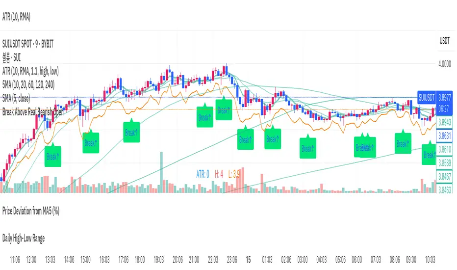
Break Above Real Bearish Open// This indicator is designed to help identify precise intraday entry points on lower timeframes.
// It tracks the most recent valid bearish candle—defined as a red candle whose close is lower than the low of the most recent bullish candle.
// When the price breaks above the open of that bearish candle with a bullish candle, a "Break↑" signal is shown.
// Minor pullback candles within uptrends are filtered out to reduce noise.
// The alert only triggers once per valid bearish setup, avoiding redundant signals.
// Ideal for detecting breakout opportunities after pullbacks in intraday trending markets.
// 이 인디케이터는 장중 분봉 기준에서 정밀한 진입 타이밍을 포착하는 데 도움을 줍니다.
// 최근 형성된 유효한 음봉(가장 최근 양봉의 저가보다 종가가 낮은 음봉)을 추적하며,
// 해당 음봉의 시가를 돌파하는 양봉이 등장할 경우, "Break↑" 신호를 차트에 표시합니다.
// 상승 중의 사소한 눌림 음봉은 자동으로 걸러내어 노이즈를 최소화합니다.
// 하나의 음봉에 대해 알림은 단 한 번만 발생하며, 중복되지 않도록 설계되어 있습니다.
// 분봉 흐름 속 눌림목 이후 돌파 구간을 자동으로 포착하고자 할 때 유용하게 활용할 수 있습니다.
Crypto Sentiment + Correlation📊 Crypto Sentiment + Correlation Indicator
Key Features:
- 🔄 Sentiment Aggregation: Measures price momentum vs moving averages across BTC, LTC, ETH, XRP, and SOL.
- ⚖️ Flexible Weighting Options: Choose between equal weight, market cap weighting, or volume-driven sentiment for tailored insights.
- 📈 Visual Candles & Background Signals: Uses sentiment-based candle overlays and color-coded signals to indicate potential shifts or divergence.
- 📊 BTC Correlation Map: Tracks correlation strength and direction between combined sentiment and Bitcoin’s price movement.
- 🧠 Technical Overlays: EMA and Bollinger Bands help contextualize sentiment trends with traditional indicators.
- 🎨 Stylized SMA Layers: Adds intuitive multi-format SMA visualization with area fill and stepped markers for easy spotting of trend shifts.
Why Use It:
Whether you're swing trading or refining entries on crypto positions, this tool gives you a snapshot of what the “mood” across major coins looks like—are the markets in harmony or diverging from BTC’s path? Use it to stay ahead of trend reversals, spot overextended rallies, or confirm bullish sentiment before you jump in.

NVDA Put Exit Alerts - Enhanced How to Use on These Timeframes:
5-15 min chart:
Look for price rejections or bounces at the weekly/monthly VWAP.
Confirm with CMF above 0.1 (buy pressure) or below -0.1 (sell pressure).
30-min to 1-hour chart:
Use to identify broader intraday swing moves that align with macro VWAP levels.
CMF will act as a filter for volume divergence setups.
